
St TRINITY - Absinthe
/ Branding
/ Bottle Design
/ Graphic Design
/ Visualisations
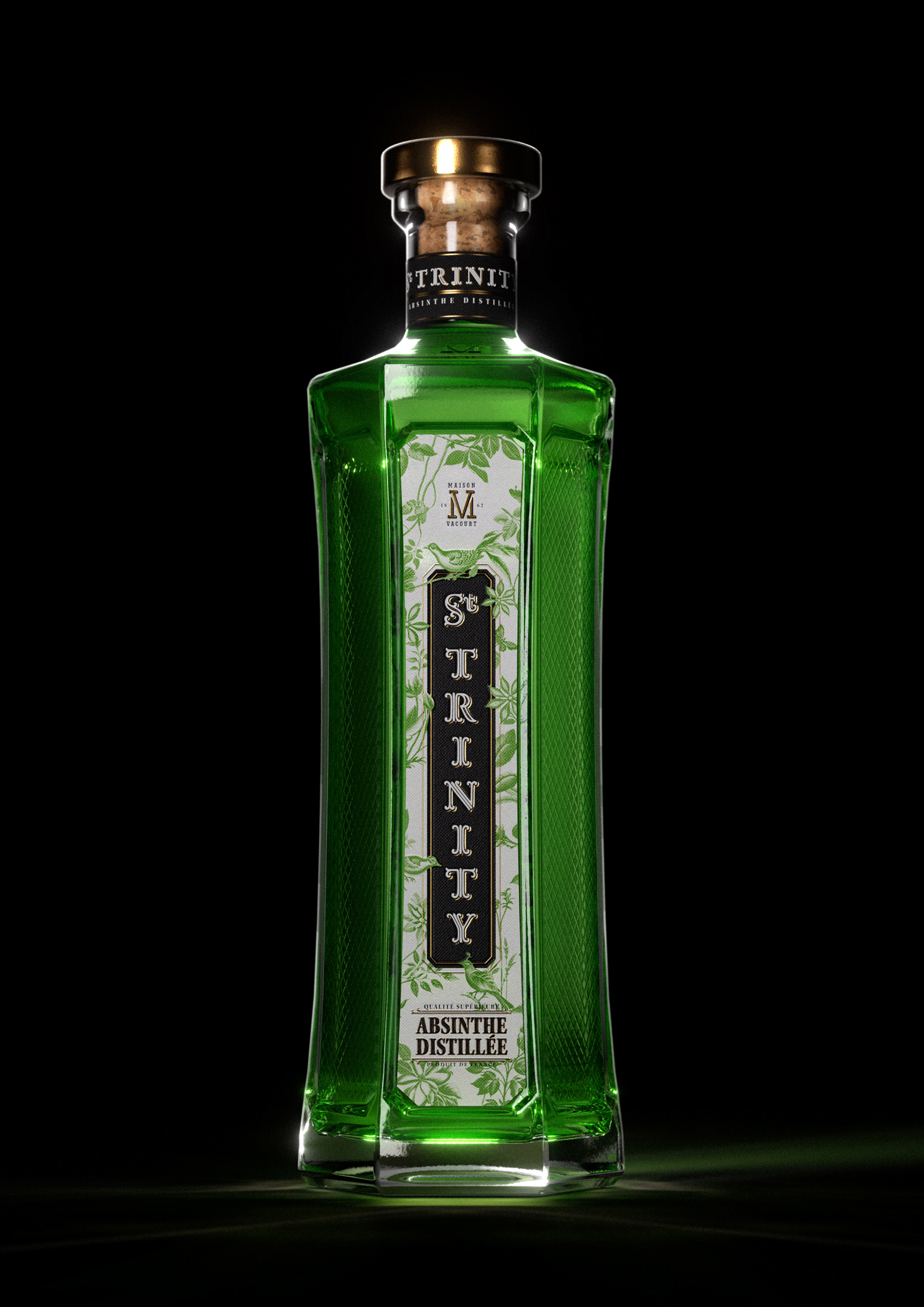
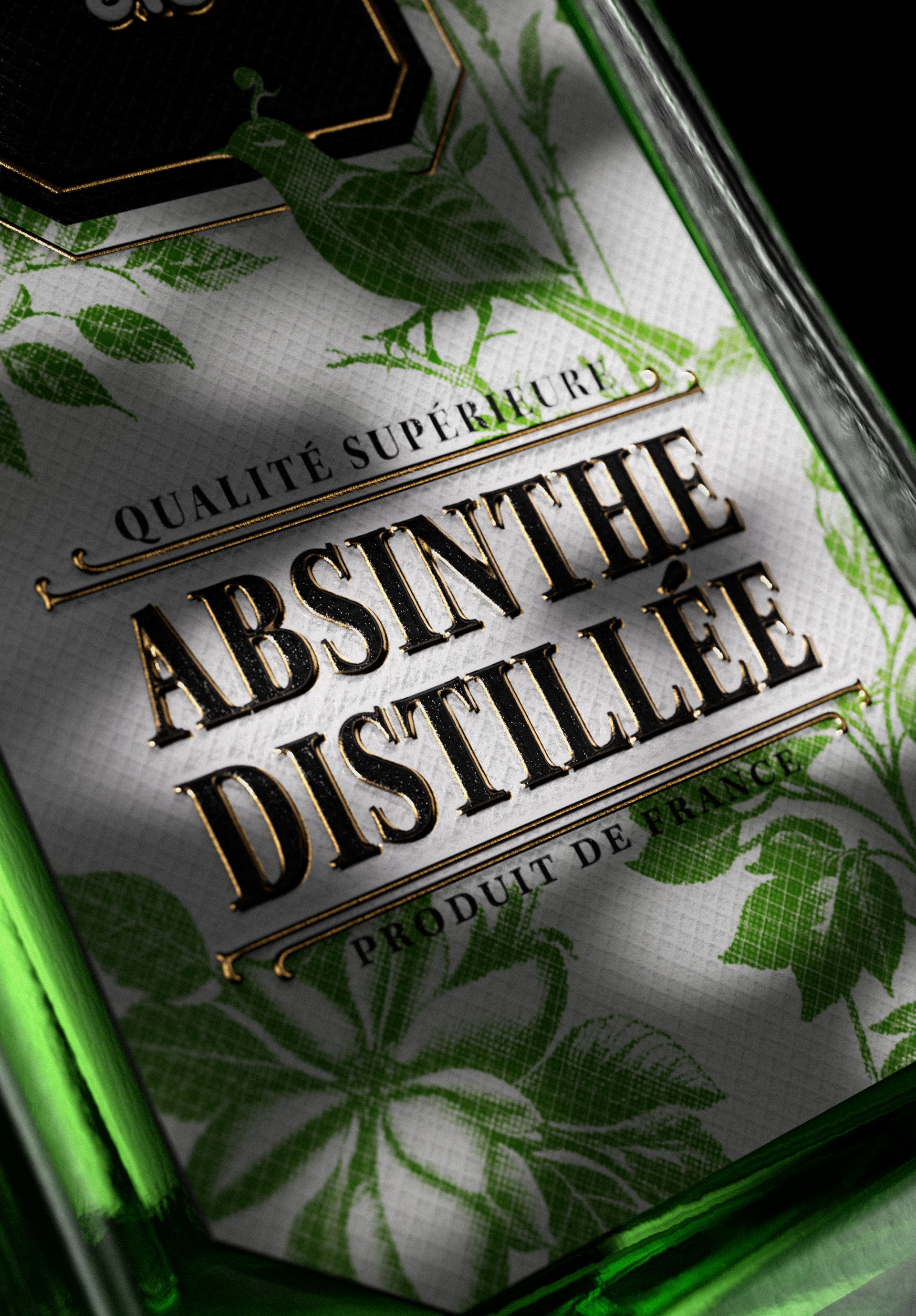
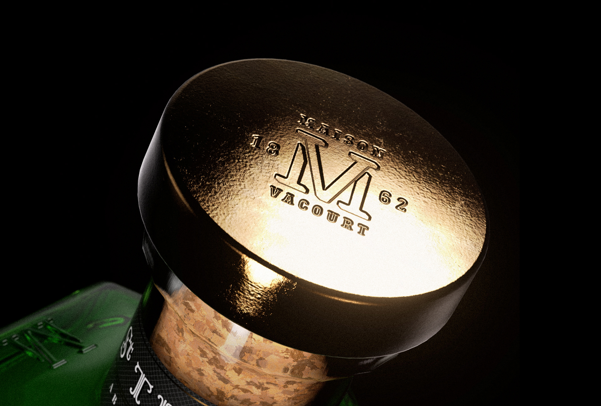
Crafted in small batches using time-honored methods and botanicals of the highest quality. St. Trinity is another name for absinthe. Distilled with wormwood, anise, and fennel, it embodies the sacred mix of these 3 ingredients. Each drop carries the essence of tradition and mystique.
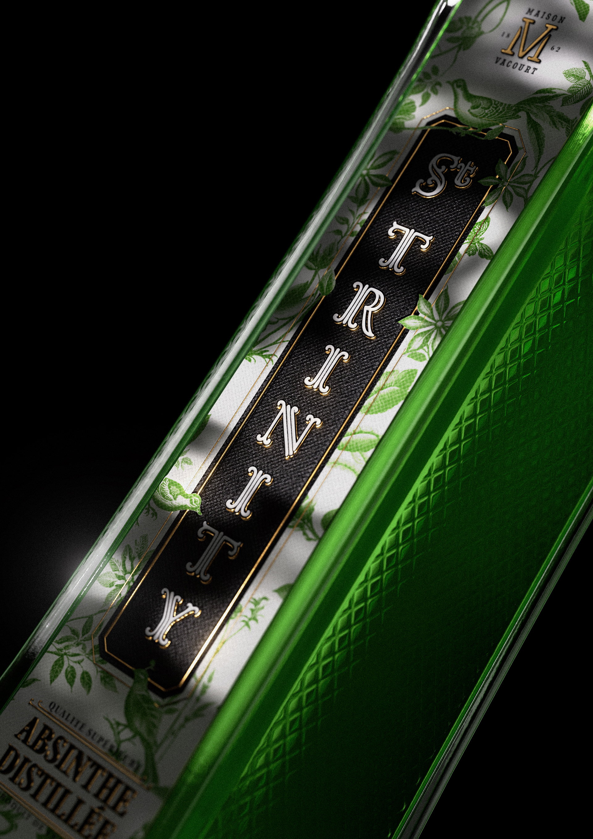
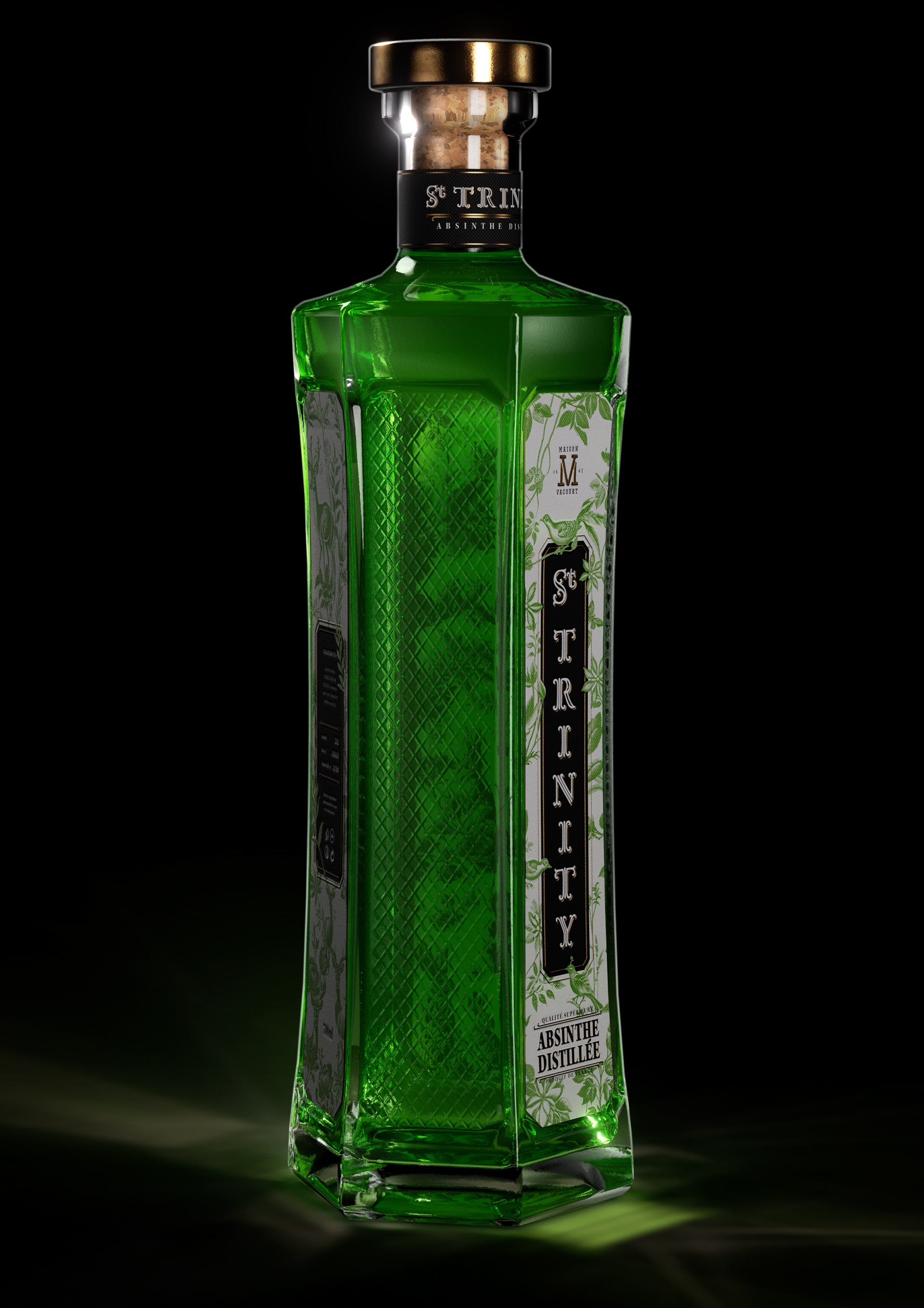
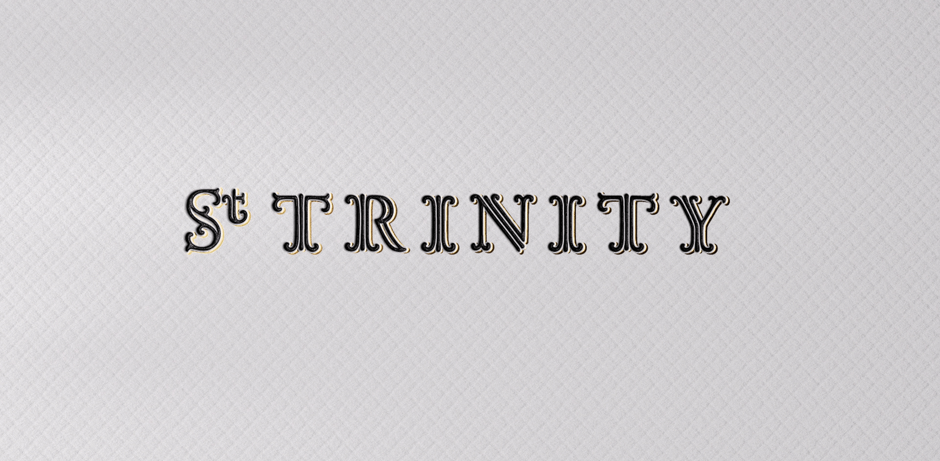
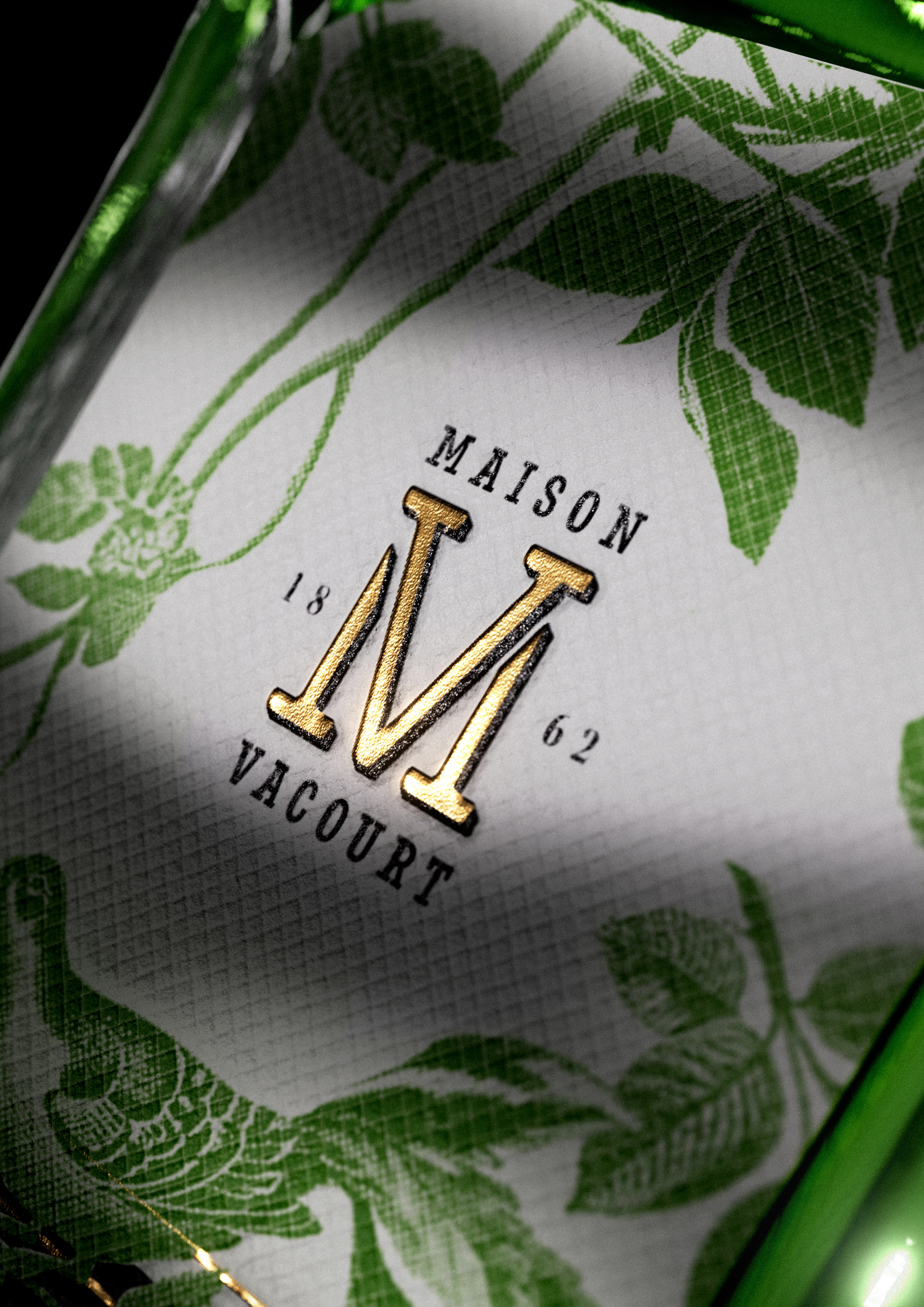
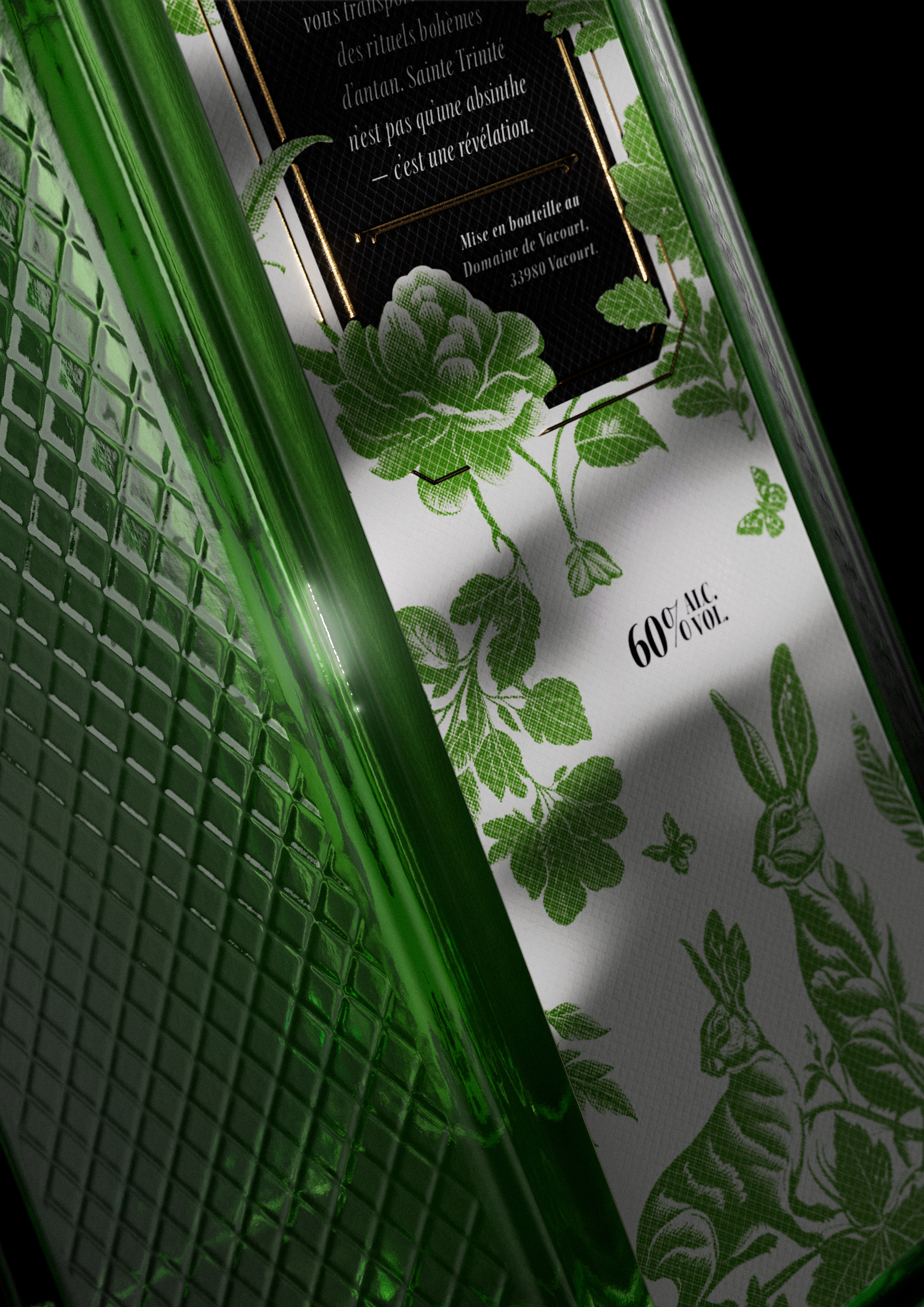
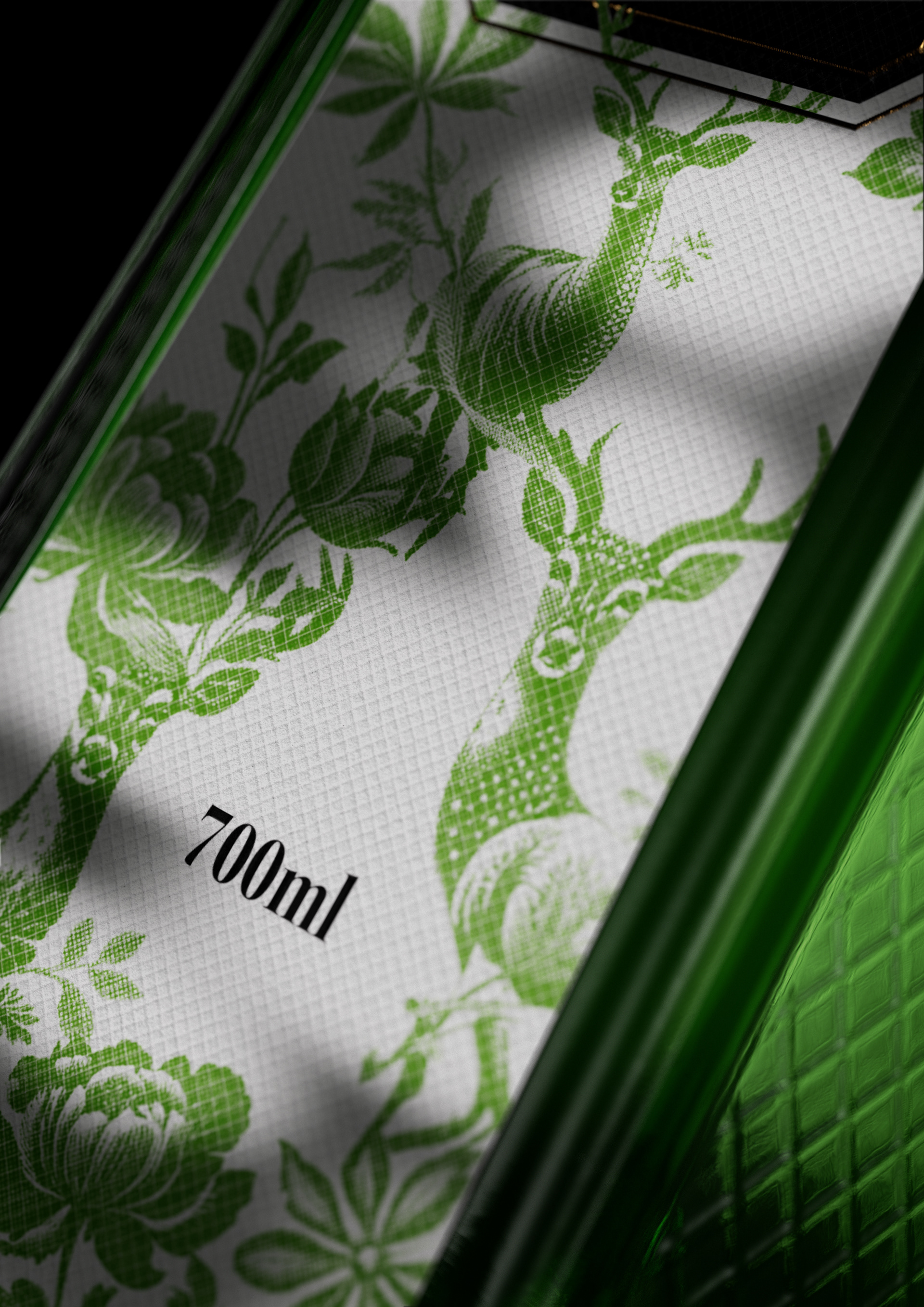
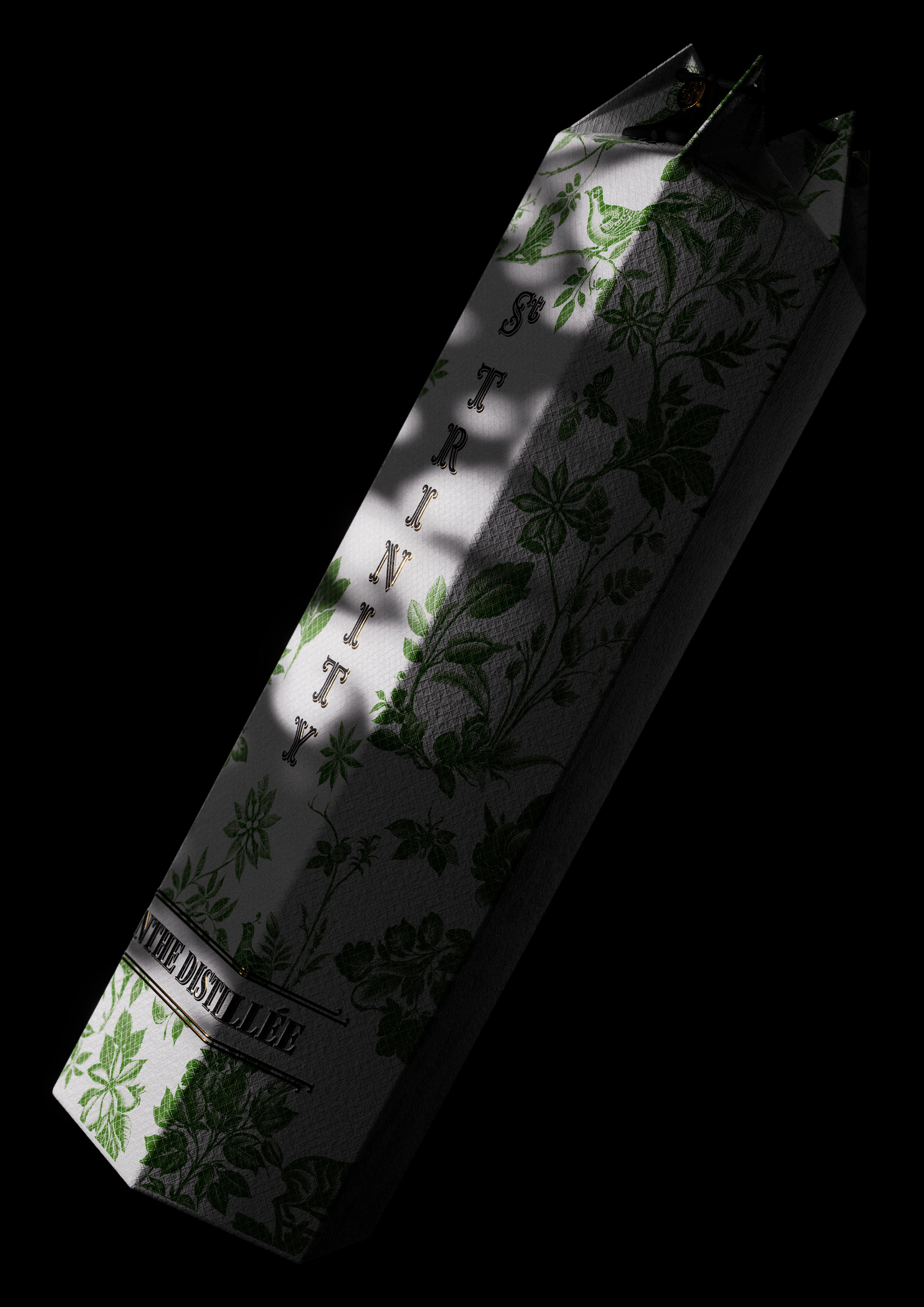
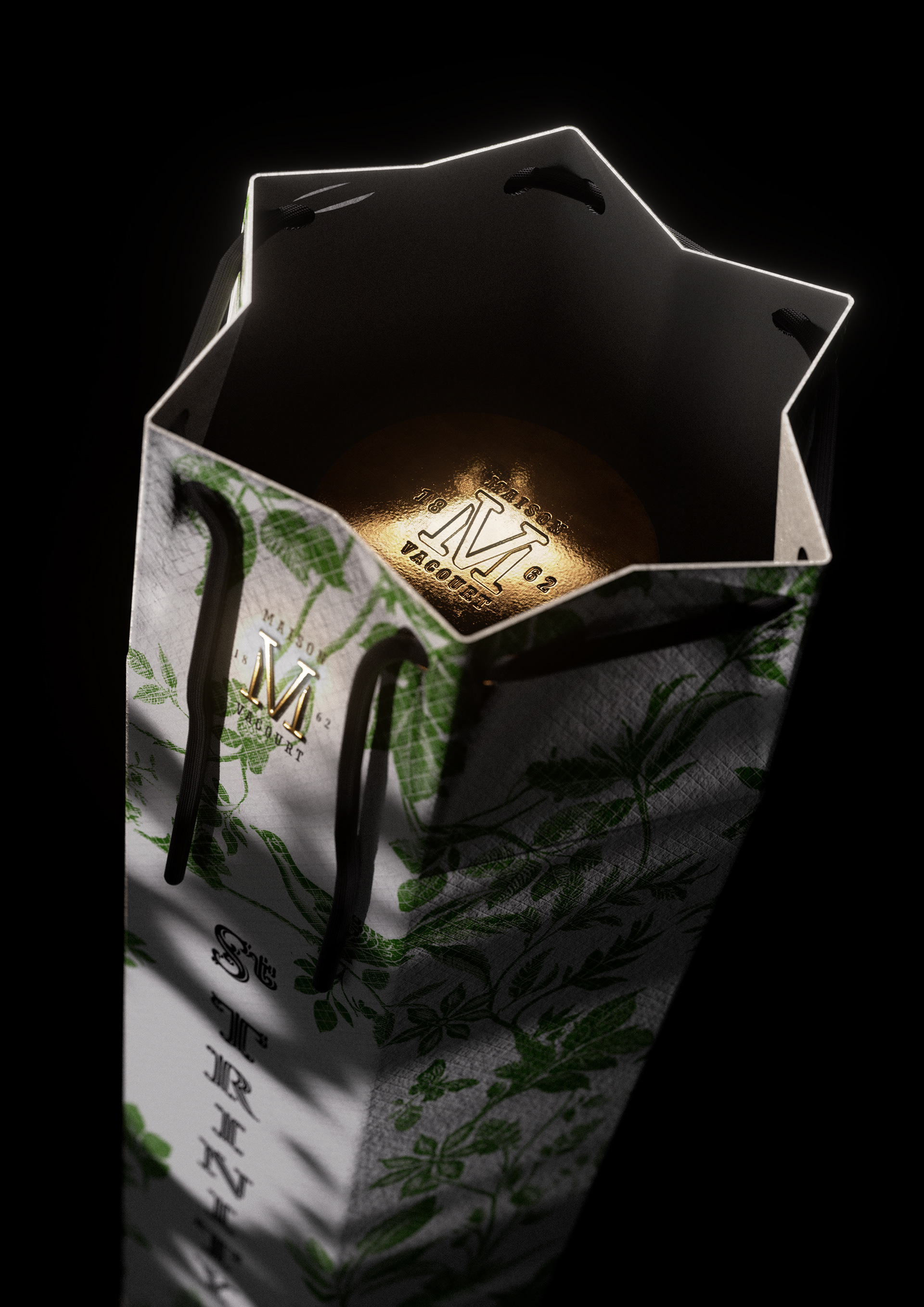
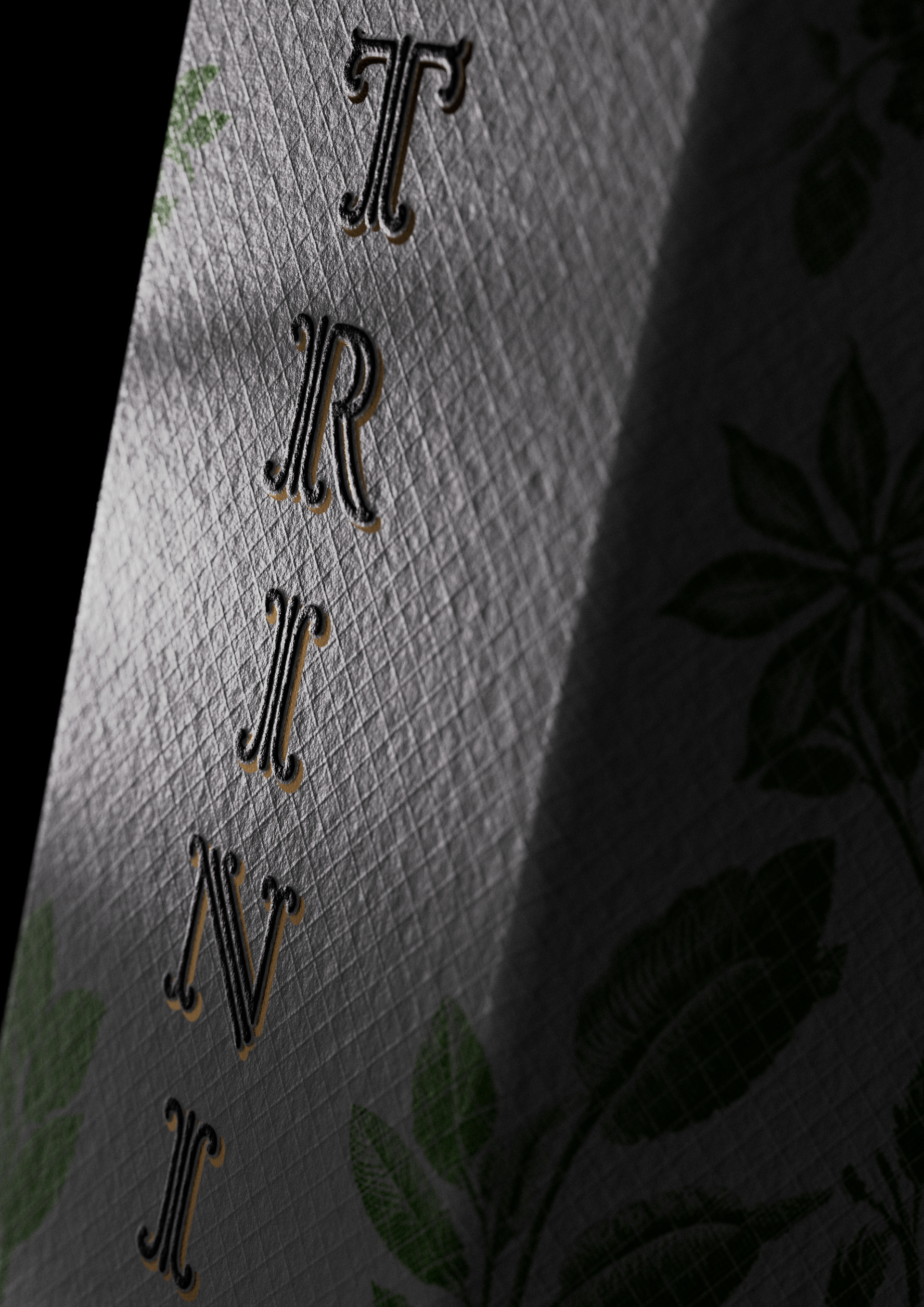
The bottle has a high, hexagonal silhouette with marked vertical lines, giving it a structured and sculptural look. It evokes a feeling of mystery and vintage charm. Textured side panels add tactile and visual contrast to the smooth center side. Designed with the help of AI, the label, like a triptych, features a serif font decorated with gold accents, which highlights its artisanal and ancient charm. Behind the text hides a delicate botanical illustration. It refers to three animals linked to three ingredients, evoking the balanced alchemy of the forest and the herbaceous complexity typical of wormwood. Using AI, the background was created in the spirit of the label. The stage is spectacularly lit from behind, projecting a green glow that highlights its color and clarity while giving it a luxurious, almost mythical aura, worthy of a spirit as legendary as absinthe.



Packaging Design project by Olivier Gricourt
All rights reserved